Author: lucywymer

Summary

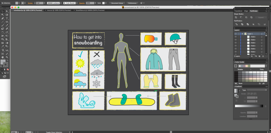
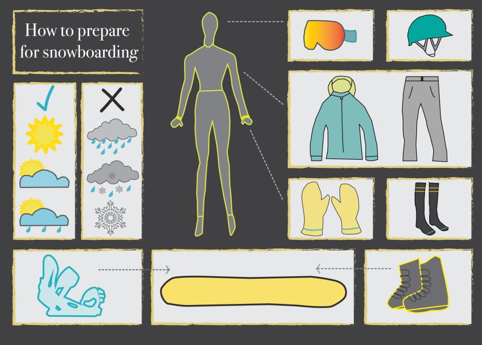
The communication objective of my infographic was to simply inform the viewer of how to prepare themselves for snowboarding. I did not want to complicate my image with a lot of text so ended up only using a title and felt that the rest of the infographic spoke for itself. As I said, after working in a snowboarding shop for a couple of years I have discovered that many people believe that gearing up for snowboarding is a very complicated process. I feel that my infographic has simplified this process and shows only the most important parts. I knew that I wanted to stick with very few colours before starting my assignment and I stuck with this and chose yellow, a teal(ish) colour and grey. I was able to effectively use different shades within these three colours.

The basic gear that you need is illustrated in my infographic and is a helmet, jacket, pants, socks, boots, bindings, a board, gloves and goggles. I began looking on Flickr for images that I could trace on Illustrator but found that snow gear and simple snowboard graphics were not popular on this site. I had trouble finding creative commons licensed photos so ended up having to hand draw my own pictures. I was unsure how these would come out and if they would look a bit unprofessional but I am very happy with how my infographic turned out. Original drawings are in my artsweb folder.

When beginning this assignment I had never laid my eyes on Adobe Illustrator nor heard of it either. I had used Photoshop in my last assignment and had got the hang of it but using a new design programme was way out of my comfort zone! I was very worried at first but I made sure to listen in my tutorials, take notes, search online tutorials and talk to friends that had more experience with the programme and I eventually began to learn how to use the various different tools on it. The pen tool proved to be very difficult at first but after practicing in class I soon realised that it was just a very careful, slow process. Once I had completed a few of my final graphics I was quite confident with it. My tutor informed us of all the different tools available and taught us the dos and don’ts of illustrator, which was very useful when completing my final infographics. When beginning this assignment I was very unsure as to why we had to use a different programme but I soon discovered that Photoshop and Illustrator are very different programmes. Illustrator is completely vector-based whereas Photoshop is based more on manipulating and editing photo real images and adding filters etc. I now understand the different uses for both programmes and am stoked to say that I can work my way around Illustrator now!

Comments

  1. You’ve got a great original idea here! As you are portraying “how to be an artist” I feel like it might be quite tempting to use a lot of colours. However, I think it would be most effective to just stick to three main colours or four at the most! You can always use different shades within these base colours. I agree with you that it might be quite tricky to trace these images on illustrator, as they are quite detailed! You may want to make the images more basic but see how you go! Looking forward to seeing the progress 🙂
    Commented on: https://toirankin.wordpress.com/2015/06/05/work-in-progress
  1. Cool idea Kelsey! Seems like you’ve really thought about something that you’re interested in and used that as your infographic. I definitely like the last colour scheme the best as it really makes the yellow stand out and the idea of light in your infographic is a main part! The dark grey and white contrast nicely together and it is all very eye-catching. Remember that you can use different shades of those main colours if you need to shake it up a little! I really like the font and the structure of your graphic as it is simple, interesting and easy to read. Keep it up!

Commented on: https://kelseyvisualcom.wordpress.com/2015/06/04/progress-4-colour-scheme-change-and-slight-idea-change

  1. This is awesome! I thought it was a model infographic that you were basing yours off when I first saw it. You’ve got a really original idea that immediately caught my attention. The colours look great together and it is really visually appealing. The layout is simple and easy to read and this makes for a good infographic. The only thing that can be a little hard to read is the orange text against the greenish background. The social media aspect is easy to relate to and the well-known brand symbols were well executed! 🙂

Commented on: https://viscommbellaireland.wordpress.com/2015/06/07/image

  1. Hey Loretta! This was such a cool idea and could have been really difficult to create but you managed to convert it into an easy to understand infographic! I really like your colour scheme, it looks like it has come straight out of a traditional recipe book. The only thing that I think could be made more effective is the font in the step by step guide as it is quite small and the linked handwriting makes it a little bit hard to read! Overall it is awesome and effectively teaches the viewer how to make pancakes in seven easy steps!

Commented on: https://lorettajanecomms.wordpress.com/2015/06/04/final-infographics

  1. Hey Erika! This is a really relevant idea to the current day as polaroids have become increasingly popular in the last year. The colour scheme for this could be really effective if it was bright and cheerful. Maybe a dark grey base with an aqua blue and orange or something! Remember to just choose three or four main base colours as infographics can get a bit confusing if you use a heap of colours. I’m looking forward to seeing your progress! 🙂

Commented on: https://erikawarneviscom.wordpress.com/2015/05/15/final-idea

Typography

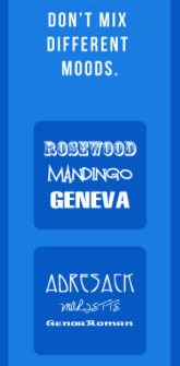
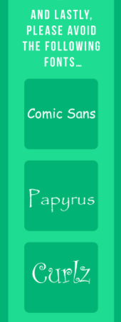
The amount of typography in infographics can differ hugely depending on the subject of it. Choosing a font for your infographic can be a very intricate process as it must blend in well with the rest of the image. Always stick to a maximum two fonts in your infographic and make sure that they combine well. In saying this, do not combine two very similar fonts, make sure to shake it up a little and contrast them! Never mix two different ‘moods’ of fonts (example shown below) as it is not appealing to the eye. It is possible to use different weights of fonts for maximum effectiveness. For example, bold your title and have an italic or regular subheading underneath. Make sure to balance the typography with the rest of the infographic. The text needs to be striking but must not take attention away from the main message. In my infographic I would like to avoid too much typography but I will have the heading “How to get into snowboarding”. I would like to find a simple, casual font that looks handwritten. Example of what I am looking for is shown below.

http://www.designmantic.com/blog/infographics/ten-commandments-of-typography/

Noteworthy

Screen Shot 2015-06-07 at 7.49.00 pm Screen Shot 2015-06-07 at 7.50.05 pm

Layout/composition

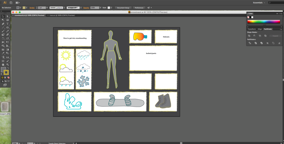
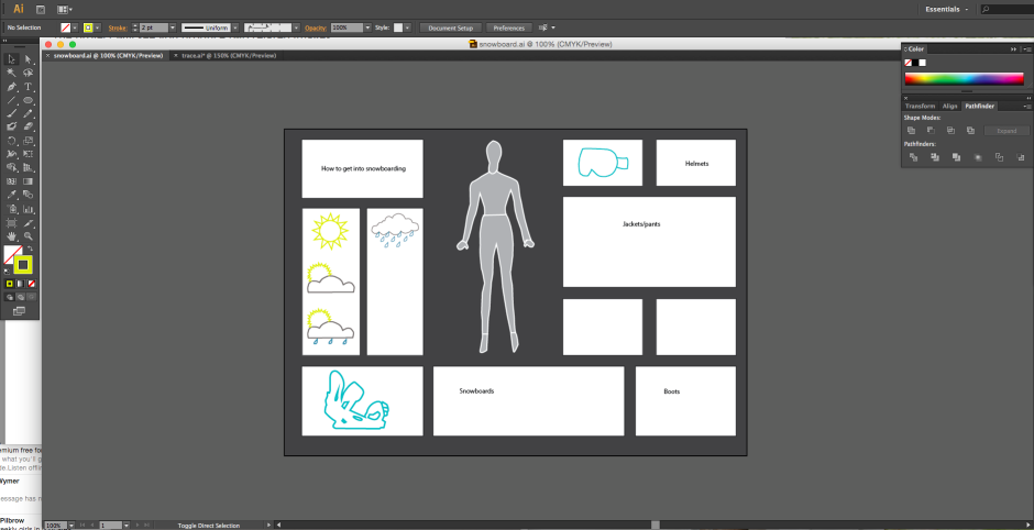
The layout and composition of an infographic is an extremely important element to it as it must be eye-catching and grab the viewers attention straight away. Simple infographics tend to be the most effective. While researching the layout of infographics I came across a “cheat sheet” for infographics. The document showed a number of general layouts for infographics and it enabled me to decide which one I thought was the most effective. I decided that my idea would be most effective with the complete visualised layout. This means that if your idea has several elements to it, it would be most effective to portray it through compelling visuals. Skip the step by step text guide and settle for simple, helpful images. The focus of this layout is the visuals, not the text. Text is minimal but often still necessary to communicate your idea. I have also realised that white space or blank areas are not at all effective and should be avoided at all cost. When beginning my infographic on illustrator I will brainstorm layout ideas but I won’t be afraid to change it up as I proceed.

Layout ideas from:

http://piktochart.com/layout-cheat-sheet-making-the-best-out-of-visual-arrangement/

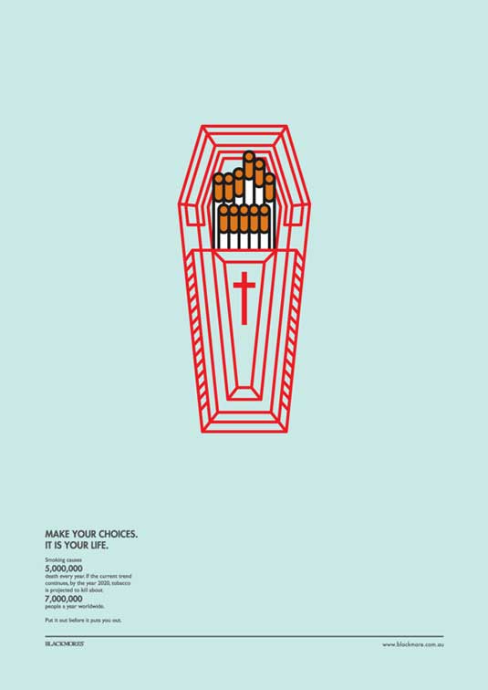
Below is an extremely effective layout/composition of an infographic. Minimal text, one big graphic and a huge message. This shows that infographics can be painfully simple yet still so powerful.

smoking2